Tuesday, 30 March 2010

Evaluation 4: How did you use media technologies in the constructin and reseach, planning and evalautiion stages

Editing the video
In order to make and edit our music video for the track doubt, we chose collectively as a group to use the program final cut as we felt as a group it offered the tools and features we required to create the right look for the video rather than using the other alternatives such as imovie. The feature of the multiple layers of audio and video was a main factor in selecting the program for the pace and house style of the editing is quick, and layering allowed us to build the video and audio together.
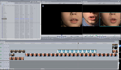

Features throughout the video were enhanced by the use of layers. The different aspects of the video helped to create a layered narrative that flows throughout the track. The split screen in the chorus featuring Jack and his younger self we decided to use a split screen to show the connection between the two characters. Jordan first layered the video, the next stage was to double click on the desired click, that then brought the clip up onto the central viewer. The viewer has the options to look the tabs video/ filters/ motion, to adapt the split screen Jordan used the motion option. In order to create the split screen you have to change to scale of the clip, to make it smaller, and then moved it to the desired place. To refine the spilt screen Jordan adapted the cropped settings of each clip as well as feathering the edge of the clip, which is all done on the motion tab. This was both used for the 2 spilt screens and the 4 split screen.
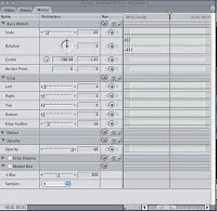

The motion tab also helped us to create the effect you see with the mirror and the bear mask. Using the basic principles of how the tab works we films jack the protagonist twice, once with the mask on, and once with it off. When it came to editing Jordan used the cropping tool to crop the two clips, so that the sequence looks like he leans down without the mask and looks up with the mask on. The contrast and brightness was altered to be the same in both clips to make the merging complete.


The flashback scene we also altered the brightness and contrast, and also desaturated these clips to give the effect of a flashback and reminiscing in the past. This is created by using the brightness and contrast tools and the desaturation filters, on the effects tab. The two transitions used were a cross dissolve and fade in/out. We felt as a group that only these two were required as the rest of video we used the other effects and tools in final cut. To create the transitions we used, Jordan selected. The most noticeable transition in my opinion was that of the fade out and the end of the video, leaving the audience intrigued.


Website
In order to create the website for the band Delphic we used a program called adobe dreamweaver. The faxc that dreamweaver is part of the adobe package, and is easily linked with that of photoshop which was used throughout our work for the digi-pak and the flash to create the website for the band. Each of these programs we found were ideal for the level of tools required to create each element efficiently. The practicality of the programs and how easy they were to use and manipulate only made the elements we were creating possible.
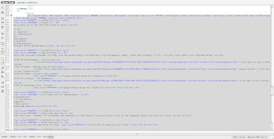


In order to create the website the elementary foundations had to be created both using a mixture of flash and HTML’s. The most challenging part for creating the website Sam found was inserting the scroll box using the HTML. Trying to insert this into the homepage we all initially found difficult however with a lot of perseverance Sam managed to work out the structure needed. The difficultly came from trying to create our own style from the code that was found on the internet. Obviously this being a stand code we had to adapt the certain parts in order to fit in both practically and visually. Initially we had to generate a code with all our text in to it, in order for the process to work, it was easier to modify this manually to fit in with our dimensions of the website, and adapt the colours and text t o suit the house style. In order to make sure all the links images and text were viewable but the public we had to upload all the images, photos, videos and animations in a folder that was linked to. The folder with all the items in would have to be held on the server that is hosting the website.
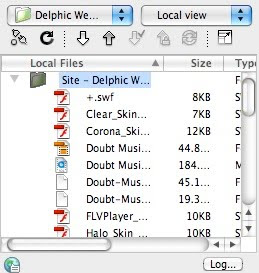


For the animated elements to the website this can be created by adobe flash, which is closely linked with dreamweaver. The animations were imported as movie files to play onto a loop for the website, showing the heading band menu system as part of the website. The colour theme is seamless following the house style of the website.


Digi-pak
The digi-pak was the final stage in creating the media to accompany the video for Delphic. We had to create a album cover and artwork to follow and fit in with the styling and genre of the band and video we had created for the track doubt. We used adobe photoshop to create the album artwork using original images on the ban d following the styling we decided upon when looking the the existing artwork out in the industry. The colours and blurred image used which was manipulated by the tools. We took down the opacity of the band image layered it with the static television for one front cover. All of the imagery shown on throughout the artwork was manipulated with the used if the different affects. The guassion blur affect was added to achieve the bright glow. By added the band logo this made the artwork complete.
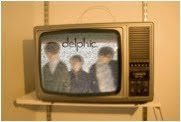


The back of the digipak was made by importing our chosen photo. We believed it would be a good idea to go along with a theme of keeping the identity of the band hidden. This was taken from the blur on the front cover and the hidden identity of the video. With our chosen photo we zoomed in and played around with what fragmented image would appear in different positions. The first idea was a picture of my neck and ear until we found the two bottoms faces together. We had to however, play with the contrast and hue to ensure the same colours from the front of the cover carried on. This was also applied to the inside panel.
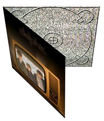
The idea of keeping the identity of the band hidden tied in with the unknown identity of one of the main protagonist in the music video. Throughout we have wanted to make the band’s style original and decision to basically hide the bands identity in various ways both in manipulating the images and taking stills of the band with makes on which obviously directly ties in with the masks featured in the video. Also this tied in with the blurred image on the form of the album artwork. With the chosen photo we zoomed in and played with the fragmented image would look like from different positions. We played with the contrast to ensure to colour were identical to those on the form of the album artwork and of course the inside panel.


Evaluation Q3: What have you learned from your audience feedback?


After completing our first proper rough cut, using the actual footage we were planning to use for real in the video, we organised a small screening of the video to the sixth form, and other teachers, to get their views an opinions. The age range of the sixth form and from some of the staff perfectly tied in with the target audience age range we identified initially, so we thought we might as well take the opportunity and gather their opinions. We then step up a interview situation with many of the audience who had only seen the video for the first time in the screening trying to get an unbiased opinion, as many within a media group had seen the video develop.


These are the questions we asked
· What are your initial thoughts?
· Where you shocked by the ending?
· D o you think the visuals correspond with the chosen song?
· What are the positive aspects?
· What do you think are the negative aspects?
· If anything, what would you change about the video?

Audience Feedback - Rough Cut 2 from WGSB on Vimeo.


From the video you can clearly see that all the audience we interviewed were enthusiastic about the video and we happily willing to take part in out evaluation process. The feedback was helpful and constructive, with mostly praise running throughout the comments made. There were obviously some constructive criticisms which in hindsight were exactly what we needed to make those few finishing touches to the video itself. I feel that by videoing the people it did not leave much room for scope for people saying what we wanted to hear, the interviewees seemed honest with their opinions and genuinely enjoying watching and taking part in the interview.

Many people came back with the comment they enjoyed the strobe lighting scenes, and the fast pace editing that matched those parts in the track. The party was meant to fit this area of the video so we were pleased that this element came across clearly through the editing and angles and of course the lighting with the strobe. Also it was mentioned quite frequently about the subtle hints throughout to the homosexual nature of the video and the revealing of the sexuality at the end with kiss, many agreed that this was a controversial ending but was fitting with the video and had a lasting effect.
It was also mentioned though that some elements such as the animals were slightly confusing to what they were intended for . The sense of voyeurism was intended with both the animal masks and the child appearing from the cupboard, and once watching this video a few more times i think this element became clearer to the audience. The idea that these element s confuse the narrative does keep the audience interested which was said during the interview.
From the feedback we made some simple changes, differentiated some more shots. To avoid the quiet basic sequences during the verses. The narrative part to the verse does need some seamless story however we used a change in pace of editing and some more shots to break this up fitting more with the rest of the video. After the changes both suggested from the audience feedback and Mrs Mcluckie, we felt we had created a video with was suitable to the target audience and has standing in the real scene of music videos. Following the conventions of a music video for this particular ‘indie’ genre we appealed to our target audience and created a video that was creditable in the wider world.

Jordan decided after finishing our final cut, to post the video on facebook to get further feedback and comments on the video and our work. He got a wider perspective of comments, and overall we as a group were really pleased with the comments and did’t anticipate such a good response. We had such a good response from and outside media student mentioning the different elements to our video and the narrative we tried to create.
Here are a few comments we picked out as being some of the best;

‘Editing to the beat can be tricky when trying to hold up a narrative. But you did it’

‘The picture in picture effect contained just the right amount of shots’

‘The reference to the child, suggesting a forgotten innocence within the character, tied in well with the video’s portrayal of today’s youth’


He also mentioned the similarities and references to the prodigy smack my bitch up video which was a massive influence on our narrative decisions the way the video was edited.


Many of the comments for Mrs Mcluckie initially led to the more narrative based story that the see in the video today, the idea was there and the storyline was all in our heads she just helped us to see the different ways of portraying what we really wanted to show, initially she didn’t like our work and carefully criticised the areas which needed the improvement and a change of plan, however in the end the video was a success, and here her help was highly appreciated.

Many of the comments also went on to mention that people could imagine it being the real video to doubt giving us a reassurance that the video has some creditability in the real music world. Our task overall was to make a music video following the conventions and methods used in the media world of today. The work and investigation into existing media products/videos really did help to make the different decisions on the various aspects of the video.

Evalution Q1: in what ways does your mediaproduct use, evelop or chllenge forms and conventionsof real media products?

In order to create the right look and style for our music video we created and devised a plan highlighting the key features we wanted in our music video which we had recognised and highlighted from looking at the other music videos for this genre and generally around this industry.
For the initial opening scene we wanted to create a party scene to open to narrative, because we had already worked out and planned the shots we required to tell the narrative it was quite easy to follow through and carry out. We used a strobe light to create the party atmosphere, giving the look of flashing lights and the underlying thought that the viewer cannot see all that's going on on screen. The shot is simple focusing on Jack the main character, with a wide shot showing both jack and his surrounding setting the scene for the video which we found to be used quite a lot in music videos. The styling of jack in 'indie' and fits in well with the genre of music. We felt Jack as a character pulled of the look we required well knowing that the characters in each music video should look like they actually belonged there. The editing followed the fast past of the music and was in time with the eh oh fragment in the song. they lightening setting and character all looked appropriate for the song and the imagery of the band when you first hear the track. The is thew most dominate to all the video we have seen that the video suits the imagery the song creates and this is what we have tried to do and feel we were quite successful.


The bedroom shot at the beginning of shot one, was vital to create the story of waking up initially within the first few seconds, the idea that there was regret from the main character was achieved by using a variety of wide shots, close ups and POV to give a wide view of what the protagonist could see. The idea was to create a sense that jack was obviously who the song was about straight away.


The use of close ups mainly through the chorus we felt tied in well with the fact that jack was the protagonist and often there is quite a lot of focus in most videos and by using him singing the lyrics this ties in with the usual music videos. For this we used really strong lighting to create the right amount of shadows for a strong shot, and different tones over Jack's face, emphasising Jack singing the lyrics. This highlights the lyrics of the song well and that the protagonist Jack is actually feeling the lyrics and their meaning, this is also shown in various music videos but especially one we took quite a lot of ideas from which was a Macabees track.


From both these screen grabs you can see the closeness of both the characters, this focus on the mouth is quite profound and actually makes a statement. The idea that the character is speaking to an individual viewer really allows the video to connect with the audience. The fact that the viewer can get infactuated with what is been seen on the screen.


The lighting is similar in both shots and provides the right balance of light and dark tone in these shots.


The flash back shots are taken from point of view shots enhancing what is being seen by the protagonist, from the various shots like reaching for the draw, and reaching for the door handle.


We used a desaturation tool to change the lighting and look of the shots in order to show the difference of real time and flashbacks. The use of a hand held camera follows the story of the sexual encouter we felt this was most appropriate and shows the link with the prodigy smack my bitch up video, where the whole video is doubt hand held with a point of view shot.


This scene is quite a dominant scene within the video showing the problems the protagonist is having and how much doubt he is having for his actions. The shots has already been seen in other music videos and we felt the camera angles and chose of editing helps to portray exactly the distress the character is in. The water running off Jacks face we felt is quite a profound image.


This other close up shot of Jack smoking for me is the other main image of the video. I think that jack lighting a cigarette and smoking it is a good way of building the character that Jack is portraying. Smoking can be seen at a choice of relief and the stress that jack shows throughout the video we feel smoking was a good way of him De-stressing.


This is our final and most controversial shot, we knew as a group that we wanted to leave the video with a controversail and we wanted the video to be memorable and this is the shot we felt most appropriate. Because of the homosexual nature of the shot the impact was immediate, this is the last shot before the video fades out, and it is just enough time to make the viewer uncomfortable to realising what is being shown on screen. We used various shots and lighting to highlight on the story.


Digi pack


The album artwork for us had to tie in well with the imagery of the band and the type of music and which genre the band Delphic falls into. The colouring and the effects of the imagery of the band created a sense of not being able to see the full picture which also ties in with the music video. The main figures in the imagery are the of the band distorted. We took an image of the TV with the white fuzz and impose the image of the band on top of it. The artwork ties in with that of the Horrors primary colours album.


.
This
This is the final website imagery, it follows the basic principles of website with the scroll down tool log in functions tabs, and links to the various areas of the website. We have followed the basic principles of a music/band websites and used the same if not similar tabs and pages for the features. We also installed the facility of watching thee video when the website goes live, so the video for Doubt can be aired. We felt when looking at the different website conventions there were all very similar especially with the content on then. often the house style and colours used were different but most of the basics like features and what actually is on the website are very similar we were very happy with the outcome and it functions well as a real website and fits well with the Delphic genre and house style.

Evaluation 2: How effective is the combination of your main product and ancillary texts?

Evaluation 2 from Jack Osman on Vimeo.


Here is a copy of our script for the voice over Jack: We have produced a series of products, including a music video, website and digipak to promote the release of an album by the band Delphic. There are several themes and images explored throughout each of our tasks that maintain a consistent house style.
Sam: The main video is a narrative based affair that follows a morning after, the night before scenario where the lead protagonist; Jack has regretted or doubted sleeping with someone. This of course resonates with the title of the song; ‘Doubt’.
Louisa: Both the digipak and video explore the theme of confusion, and hiding your true identity. This is represented via the use of animal masks. In the video this theme is explored more explicitly with Jack masking his homosexual feelings; in attempt trying to convince himself he is heterosexual before coming to terms with the truth.
Jordan: In the digipak the masks are used on the inside sleeve opposite the disc tray, this is to hide the identity of the band itself. This is something we have consciously decided to do, in order that there is more emphasis on the band’s music rather than image. Additionally it creates an air of mystery surrounding the band, which may intrigue potential audiences.
Jack: The fact that Jack masks his homosexuality is referenced throughout our video in a variety of manners. Most notably in the scene where he looks up into a mirror to be haunted by the image of himself wearing a bear’s mask. The split personality in the mirror represents the trouble he is having choosing his sexual orientation.
Sam: The video culminates with Jack battling through several party goers adorned in the aforementioned masks, as the feelings of paranoia and regret take over Jack tries to escape the clutches of scene of the incident by running towards the front door. Upon opening the front door he comes face to face with his ‘one night stand’ and finally accepts his homosexuality.
Louisa: The theme of bright, neon lights is continued throughout all three promotional products. In the video this obviously applies to the shots of the strobed party.
Jordan: On the digipak the television dominates the album artwork with a bright glow, to illuminate the image and the presence of the band. Furthermore the links tab and the updates section on the website are coloured in bright green and blue thin strips representing neon lights. This theme ties in well with the electronic genre of the music.


Thursday, 18 March 2010

Individual Responsiblity

In terms of the responsibility of the different aspects of the the task within our group, most of the research and planning was done collectively with each of the members having an equal share of work and input into the design and planning. We used both official meetings, lesson time and outside of lessons to discuss and plan the work and set out the tasks that needed to be done. Most of the filming was conducted by Sam and Jordan as I was involved and in charge of lighting and positioning within the shot, Because Jack was involved in many of the shots he often was on the other side of the camera but tried to take a filming role as much a possible. When it can to the editing Jordan took the main role of editing as he has the Best knowledge of the program used however each of us collectively worked on sections of the film. Sam being familiar with working on the Website with his previous knowledge of Dream weaver fitted well with him taking the main role in creating the website, with jack and I input with visual and textual content. When it came to the digi-pak jack and i took control of creating the
visuals, we swapped and changed throughout giving our each individual input to the work, to get the best possible results.

Jordan - Video Editor, Cameraman, Digipak Editor, Website Editor
Jack Osman- Digipak Editor, Cameraman, Actor, Video Editor
Louisa Herbert- Lighting, Digipak Editor, Video Editor
Sam Avery- Website Editor, Video Editor, Digipak Editor, Cameraman

Rough cut 2 feedback

Doubt Rough Cut 2: from Jack Osman on Vimeo.